UX Research Case Study
Equinox Payment Terminal Usability Issue

Whether it is an insertion, swipe, or tap-and-pay, most people are familiar with how to insert their card into a payment terminal when checking out. However, I ran into a situation where a lot of users at Walgreen's pharmacy were having a lot of trouble figuring out how to put their card into a new payment terminal, the Equinox Luxe 8500i. As a UX Researcher, I recognized this as an excellent opportunity to provide an objective and independent assessment of the user experience. Since I was not part of the Equinox product team, I did not have any perspective into the research that produced the new design, but I felt I could at least try to justify some recommendations based on actionable data from my own research. As a bonus, I discovered Chipotle also uses the 8500i and was experiencing similar issues.
Introduction
Initial Questions
-
What is the frequency of this issue?
-
Is there a temporary workaround?
-
How are payment design patterns used by competitors? (e.g. card chip icon & slot)
-
What design patterns do users find the most intuitive?
Objectives
The overall goals of the research were to identify:
-
root cause(s) of negative user experience
-
similarities/differences with competitor designs
-
opportunities to resolve user pain points
Tools/Methods
Surveys
Stakeholder Interviews
Ethnographic Field Studies
Usability Hub
Competitor Analysis
Quantitative Analysis
Qualitative Analysis
Adobe XD
FigJam
Google Sheets/Docs
Slack
Design Study
My Research Process
The initial questions made a great start as I identified various UX Research methods that would help answer them. The methods correspond to the Test and Listen stages according to the Nielson Norman Group. User observation and follow up interviews also helped identify root causes and potential resolutions.
What is the frequency of the issue and root cause(s)?
Ethnographic Field Study
Observe customers using terminal
Stakeholder Interview
Ask cashiers/managers for estimate frequency of issue
Is there a temporary
workaround for the issue?
Ethnographic Field Study
Observe cashiers interacting with customers
Stakeholder Interview
Ask cashiers/managers what they have already tried to resolve issue
How are payment design patterns used by competitors?
(e.g. card chip symbol next to slot)
Competitor Research
Review design patterns associated
with payment options such as swipe
What payment design
patterns do users find the most intuitive?
Design survey
Design survey where user matches
orientation of payment card with
different design patterns
1) Frequency of Issue - How often did customers insert card wrong?
Terminal Description
8500i with no note
8500i with Note
Legacy terminal*
Failures - Walgreens
78%
36%
0%
Failures - Chipotle
78%
* uses traditional card symbol
2) Temporary workaround? - Is there an easy fix for the issue?
-
Nearly all of the cashiers indicated that they had to explain how to insert card correctly to customers when they checkout
-
Adding a note helps drive the failure rate down by nearly half
3) Root Cause(s) - What factors are contributing to the issue?
FAIL

SUCCESS!

FAIL

SUCCESS!

Factor #1 - Customers DO NOT understand the card symbol on the 8500i

The payment card security chip is always in the same slightly off-center location from midline of card.

The 8500i shows the security chip almost touching the side of the card.
"That symbol doesn't reallly tell me anything" - Walgreens customer
"I kinda guess when I put my card in" - Chipotle customer
"I've seen that sign at Walgreens, I wish we had that here" - Chipotle cashier
"I don't know what they(Equinox 8500i manufacturer) were thinking" - Walgreens cashier
"Chip is in weird place on that symbol" - Walgreens customer
"I tell people all day how to put the card in" - Walgreens cashier
Factor #2 - 8500i has a very steep insertion angle compared to other card readers
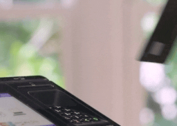
Proper card insertion
equinoxpayments.com

Card fully inserted at Walgreens


Card fully inserted at Walgreens
Card fully inserted at Chipotle
4) Competitor Research - How do they compare with the 8500i?
-
Most existing card symbols, including the Equinox legacy model, show the security chip in a full size card along with some arrows
-
Users insert card with no steep angle
-
Many include arrows to help show correct card orientation
Verifone VX 520

Quest UT430

Ingenico 3070

Quest QT720

PAX PX7

Equinox 8500i

Equinox 5300 (legacy model)

Ingenica ICS150 - card clearly faces user
Ingencio ICS150 - card clearly faces user

Walgreen's cashier showing ow customers initially approached the NEW 8500i
How customers initially approached the NEW 8500i

Overview of card symbols used from Competitive Analysis - does one of these stand out from the rest?


SUMMARY
-
Most existing card symbols, including the Equinox legacy model, show the security chip in a full size card along with some arrows
Default security chip location
Default security chip location
-
Users insert card in a mostly flat orientation with no steep angle
-
The Equinox 8500i shows a partially exposed card with the security chip in an unusual location, and does not include any arrows to provide guidance to the user
Card is partially exposed but chip is still visible
Security chip is never in this location
card slot
Equinox 8500i does NOT include any arrows

card slot
5) User Testing and Survey - What are possible solutions to this issue?
Prior to brainstorming with the team, a few options are presented to help the discussion get started.
Option 1
Moving location of security chip on card symbol to the correct location, rotating, and including arrows might help visually communicate better. However, this may resemble the original issue since the card is placed on top of the slot.
Original
card slot
card slot
Option 2
Since the location of the security chip on the card will not change, reviewing the scenarios leading to a successful card insertion shows that the location of the magnetic stripe will always be on the left side.
Original
card slot
card slot
UX Research methodolgy for testing Options 1 & 2
A Design Study was chosen for this section since it essentially combines a preference test with a survey. For each image, users were asked to choose the best card insertion, explain why, and then provide feedback on the card symbol. I also included the original design to see if the original issue frequency would be similar with the test data.
Original card symbol

27%
0%
0%
73%

Summary
The test data was very close to the observed failure rate. The design of the test is valid!
Option 1

0%
2%
98%
0%

Summary
Choices C & D did not resemble card symbol and were NEVER chosen. However, most people associated the chip but the arrows confounded the problem and made it worse! This option is going the WRONG direction!
Option 2

100%
0%
0%
0%

Summary
Option 2 presented the user with the exact way to enter the card with arrows indicating what they should see as they enter their card! Intuitive and simple. We have a Winner!
Reflections


Why I did it
-
Research is FUN and this was a golden opportunity to investigate a real field issue
-
I wanted to use my research data to provide feedback to the manufacturer of the 8500i
What I did
-
I observed a usability issue in the field very soon after introduction of a new payment terminal that was occurring at multiple locations
-
As a curious UX Researcher, I designed a Case Study to research the issue and possible solutions
What I discovered
-
Most users did not initially understand the card symbol used in the new model
-
Many used trial and error to resolve issue
-
Some stores placed instructions directly on card reader for proper card insertion and also verbally coached users
-
The steep angle of card insertion may contribute to issue
-
Most other competitors DO NOT use a steep card insertion angle
-
Most other competitors use arrows with their card symbols
-
My research into solutions did not capture the steep perspective possibly biasing the data since it did not reflect the angle the user would observe the card fully inserted
-
The workaround covers the other Equinox logo beneath the keyboard
What I did about my discovery
-
I used my research data to perform root cause analysis, quantify the issue, identify possible workarounds, and validate possible solutions
-
I shared my results with the Equinox team as well as Walgreens and Chipolte
-
I followed up with their responses
What I would do differently next time
-
Determine if other locations are using a workaround like Walgreens
-
Study card reader placement using research methodologies such as focus groups, moderated tests, shadowing, etc.
-
Study iconography techniques in order to provide more robust solutions
-
Engage with Equinox earlier to possibly gain insights on how I could collect and share better UX Research data with them