Breeze Digital Wallet


Business Requirement Features

Although the term digital wallet has many definitions, Breeze has the following basic features:
-
2-factor authentication
-
Transaction history search
-
Fund transfers(e.g. send/receive/save money)
Problem Statement & Hypothesis
Problem Statement: Online shoppers need a way to securely make purchases without using credit cards because they do not want to repeatedly re-enter all of their credit card information for each site.
Hypothesis: We will know this to be true when we see a majority of customers making online shopping purchases with a digital wallet app instead of their credit card.

Possible Problems
-
Popular shopping websites do not accept
the digital wallet app -
Customers do not believe the digital
wallet app is secure -
The app only works with secure Wi-Fi
connections
Possible Solutions
-
Negotiate partnerships with popular shopping websites
-
Highlight security feature on login screen
-
Implement an alert on the app that describes risk and suggests solutions
Hypothesis Testing and Results
An online survey was analyzed before the finalizing the interview questions. The interview questions were validated and refined after collecting over 20 responses. Three phone interviews and two in-person interviews were conducted.
I documented the interviews with and added specific follow up questions unique to each person. The interviews lasted between 40–60 minutes. Some interesting discoveries were made along the way after I summarized each response and then asked follow-up questions. Also, the ordering of the questions helped with the transition from follow-up questions as well.

Initial Conclusions
-
The term “digital wallet” is often applied to a single app instead of a category of apps
-
Users prefer a clean categorized transaction dashboard over simple high-level summary data
-
User either pay a lot of attention to transactions fees or entirely ignore them as typical added fees
User Personas Slideshow
Based upon my initial research, I created three personas to represent the motivations, behaviors, and challenges of Breeze users. The process of developing personas was especially fun as I was able to visualize different how different users might find using Breeze not only useful but simple to use. I found it interesting that I was learning how to develop empathy with these personas even though they were not real people.
User Flows Slideshow
I used my personas to create a path of interactions in order to complete common tasks. This step helped me further visualize how a user would use Breeze and how I might make the process more efficient without leaving the user confused. Although I wanted the flows to carry a similar theme, I quickly noticed that simple feature enhancement could add a lot of complexity that might not best serve the needs of the user. Furthermore, each flow had to integrate into the overall functionality of the app so that it would not distract from the other features. This step helped me predict how to keep myself aware of the balance of the app as I started putting features together.
Testing & Analysis
Developing wireframes was initially a difficult stage for me as I wanted everything to look correctly right away. My initial sketches were were converted into wireframes using Balsamic and then refined into my first prototype using Adobe XD.
Budget coach marks

Quick navigiation

Account summary

Search transactions

After recruiting five volunteers, I conducted usability tests and summarized the results in a table. Some of the results made me realize that I had made assumptions about the user while other feedback confirmed some of my expectations.

Challenges
-
UI attempted to visually communicate a lot of features and functionality but ended up confusing users
-
Several screens included too much functionality and navigation options
-
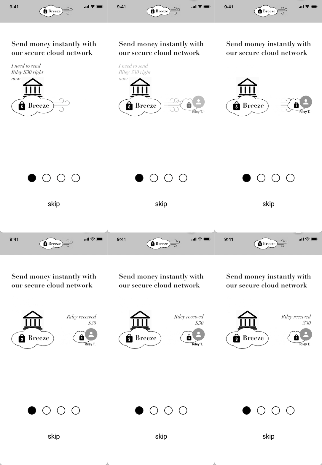
Onboarding animations were interesting but not visually informative
-
Some user flows included niche features that confused users
Lessons learned and Resolutions
-
The UI induced some cognitive overload that trying to visually communicate too many features. I must reduce several visual elements that attempt to convey too much information. Conversely, common elements such as a chevron to indicate an element is clickable must be used when applicable
-
Focus on the specific user task instead of potentially overwhelming the user with additional features on the same screen. I must keep adhere to an intuitive and efficient information architecture to provide the user navigation to other features.
- Onboarding animations can distract the user from the intended message. I need to replace animations with a simple graphic and text to convey key features.
- Some UI elements that do not include text may be ambiguous and therefore ignored. Instead, I should use more established design patterns such as button with descriptive text.
Highlights of many, many, many iterations
Challenges with Login screen iterations
My early iterations of the login screen focused variations of themes involving a lock, clouds, and wallet elements. However, trying to combine all of these elements together resulted in conflicting emphasis between them instead of depicting a cohesive balance. Additionally, A/B testing often showed variations both at nearly 50%. I realized that none of these iterations were effectively visually communicating the overall theme I intended.
V1

-
Promoted relaxed tone and ease of use
-
Did not look like a serious financial app // with security features
V2

-
UI made app look secure and futuristic
-
Resembled a gaming app with a "Matrix' theme
-
Large button size created imbalance in UI
V3

-
Title font weight made app look sleek but not convey strong security
-
Graphic created too much complexity in UI
-
Gradient was distracting
V4

-
Bold title made app look strong and secure
-
Gradient transitions were not smooth and looked jagged
-
Button colors did not fit into gradient well
My solution
Although V2, which I called the 'Matrix Theme', was found to be the most popular, I recognized I needed to step back and focus on how to visually communicate my theme with more simplicity. I had to create balance between elements and eliminate cognitive overload. Also, since a lot users shared a sense of anxiety when completing transactions with a financial app, I focused on promoting a sense of calm and tranquility to reduce any potential anxiety.
-
I created the 'Night Theme' with a subtle gradient to promote calm and tranquility
-
The lock and wallet elements were eliminated in order to reduce cognitive overload
-
Button sand font sizes were reduced to create balance between elements
-
A ghost button was used for the 'Show me more' CTA to reduce conflict
MVP

FINAL

Challenges with Onboarding iterations
A great movie trailer will motivate a person want to go see the movie. Similarly, a great onboarding experience should make the user eager to use an app. The attention span of the user must also be taken into account since many users can lose interest during the onboarding process. I took upon the challenge to implement animation although my process more closely resembled account-focused type of onboarding since I needed users to feel comfortable connecting financial cards to their Breeze account.
V1

V2

V3

V4

-
Animation was too fast
-
Several UI elements were too small to read
-
Message did not indicate user's motivation for this feature
-
Better messaging
-
The italicized body text made the app look less formal
-
The gradient background was not smooth enough
-
Navigation controls too cluttered
My solution
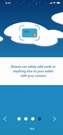
I discovered that glitzy animation does not always serve the needs of the user and must have a distinct purpose so as not to be appear ornamental. Again, I had to scale down sizes and UI complexity to provide a simpler message to keep the user engaged with the onboarding process. To acheive this balance, I found Version V4 also maintained the overall app theme well and iterated further to create the final onboarding screens.
-
Messaging less like a user manual and more conversational yet still informative
-
Simple graphics and unobtrusive navigation
Final Onboarding 1

Final Onboarding 2

Final Onboarding 3

Final Onboarding 4

Challenges with Pay Person iterations
A key feature of digital wallet, banking, and money transfer apps is sending a payment to another person. While each app using similar design patterns for this task, each has their own nuances and added functionality. Furthermore, I wanted Breeze to meet or exceed the key features of these apps but encountered that the information architecture could easily become very complex for slight enhancements. I needed to find a way to bring all these features into Breeze without overwhelming the user.
V1

-
Navigation too cluttered with large icons
-
UI elements too large
V2

-
Duplicate functionality at top of UI for adding card
-
Navigation improved with smaller and less icons
V3

-
Search contacts button looks out of place and introduces another step to find Payee
-
Option to pay person or pay a bill useful feature
V4

-
Larger image of card takes up too much space
-
Current payment source ambiguous
My solution
My desire to provide a lot of functionality resulted in significant cognitive overload. Again, I needed to step back and look at the specific task the user needs to complete without adding additional distractions. I decided to take the best parts and create clean sections for each.
-
I decided to take the best parts and create clean sections for each
FINAL

Challenges with the Wallet screen
A common wallet design pattern was to represent a screen has a section for payments cards and another everything else. However, my onboarding said Breeze can hold anything you can scan in with a camera. I had fun going in different directions trying to make this screen something a user could understand as easy as their physical wallet.
V1

-
Forced user to use only two types of wallet content
V2

-
Sections provided for wallet content categories
-
Too much UI for category
V3

-
Separators helped with UI but did not resolve category content clutter
V4

-
Simple text and chevrons made UI much simpler
-
Option to create more groups for anything user wants to scan
My solution
The strategy in iteration V4 was my ticket to creating a resolve the complexities of what I wanted to visually communicate. I continued to experiment with ways to make the UI much cleaner.
-
Elimination of separator made UI much smoother
-
Reduction in font size helped overall balance of UI
MVP

FINAL

Final Flows
Login, Onboarding, Signin Signup
Login Screen
Onboard 1
Onboard 2
Onboard 5
Onboard 4
Signup options
Signup


Add account and Payment method
Scan card
Add acount verification

Add payment method choice

Play Money account info


Type card info

Add payment info verification

Acount Add Card Confirmation
Wallet View


PayPerson
Wallet Screen
Wallet Account
Send Money
Pay Person
Add Amount and Note
Confirm Payment
Payment Sent
Confirmation


Schedule Payment
Scheduled payment
confirmation


Struggles and Lessons Learned
Throughout earlier parts of the projects, I was trying too hard to provide flexibility with multiple opportunities for adding functionality and impressive animations. After taking the opportunity to step back and take a fresh look, I recognized how I made a simple task into a confusing whirlwind of options. What helped me get away from this tendency?
-
I captured screens from many, many popular and diverse apps and measured the size of elements whether it be a buttons, text , separators,.... I was surprised how simple small and concise the design patterns actually were. This helped me see how I could express my components without the need the shout them.
-
A lot of my initial design were attempts to duplicate another successful app. However, I when I took it a level deeper and started to really study the different design patterns of each, I began to appreciate the strengths and motivations and how these created a cohesive theme throughout the app.
-
I need to step back more often and come up with unique variations instead of just re-iterating similar themes. I was able to apply this when I came up with the overall theme for Breeze, Instead of just taking stabs in countless different directions, I began to think of how the design could solve a variety of the needs of the user instead of just looking flashy.

